

With less than 10 hours to go before the polls open for the 2012 Presidential election, I thought it would be a good time to remind you about the importance of using cartograms to study business, political, and socioeconomic data. Cartograms should be a constant tool in your intellectual toolbox that you utilize to overcome the handicap most people have when their brains try to visualize numbers. I talked about this a couple of years ago but it is so important than I want to revisit it.
[mainbodyad]For those who don’t remember what a cartogram is, it is a special type of map in which geographic distance or area is replaced by another variables, such as population. It creates a short-hand visual representation that more accurately reflects whatever it is you are trying to measure.
An example could help. Think about the geographic map of the United States. When most people try to picture the Presidential election, they visualize the map as it appears in classrooms. That is, each state is drawn based on the square miles within its borders. The problem? That is a meaningless variable for the purposes of electing a president. Showing data this way does not lead to better decisions, it leads to worse thinking.
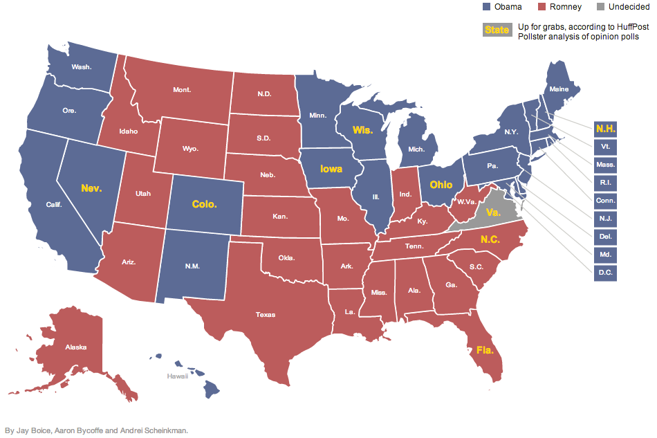
This is how the estimated polls look geographically based on the data available roughly 10 hours before voting starts.
That map is not a good way to convey data because it grossly misrepresents the electoral college. Under the electoral college, each state is given a vote equal to the number of representatives it has in Congress (e.g., Missouri has 2 Senators and 8 representatives in the House, so we get 10 electoral college votes). There are 538 electoral votes in total. (The more informed among you will wonder how that is possible, given that there are 435 members of the House and 100 Senators, equalling 535 electors. The extra 3 are given to the District of Columbia, home of the nation’s capitol.)
Whomever receives 270 electoral votes or more wins the job. If we redraw the map as a cartogram, with each square representing 1 electoral college vote, a person can glance at the page and instantly “see” which way the election leans.
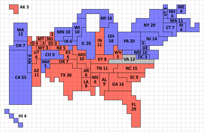
This is how the United States actually looks. This is the influence laws have, this is the way politics works. Each square represents one (1) electoral vote. To win the office of the Presidency, a candidate is required to win 270 electoral votes. The current polling gives Florida to Mitt Romney and Ohio to Barack Obama based on the estimates of most of the statisticians, but they are still technically tossup states.
This should be the goal of your reports, presentations, sales pitches, etc. Any time you want to illustrate data in a way that it can be understood instantaneously, think about modifying the variables so that size represents whatever should be the measurement. In this case, it is electoral college votes that are more important than square miles of real estate.
Love the cartogram. Embrace the cartogram. It can only help you be a more effective communicator. That, in turn, can help your career.
From a purely analytical perspective, the race is not close. The media switched to reporting a near even split in the popular vote because it gives the illusion of a tight contest, which is good for ratings. Taking a cartogram approach, you can calculate the probabilities and realize why the statisticians lean heavily in favor of one candidate.
How could this help you make money? If you are a restaurant chain trying to expand across the United States, you could recast your data into cartograms to see which communities, or cluster of communities, are the most attractive for your brand. If you are managing a portfolio of dividend stocks, you could see, visually, which companies were the biggest contributors to the cash streams that flowed into the portfolio to help you understand where the biggest risks are. Seeing 1% vs 10% is one thing, but a picture of an actual square that is 10 times larger will click with your brain instantly because of quirks in how our minds developed.
[mainbodyad]
Reader Comments (7)
Comments are presented chronologically, with replies indented beneath the comments to which they respond.
James
November 6, 2012
For some reason, I have a feeling that the statisticians are gonna get this one wrong. I think there is a quiet undercurrent of support for Romney that is not being picked up in the polls. An undertoe, if you will, that is not visible.
Joshua Kennon
November 6, 2012
Replying to James
It's definitely possible. Although data analysis and collection is much better today than it was thirty two years ago, no one saw Reagan winning in 1980 because going into the election, Carter was ahead the polls.
Regan
November 17, 2016
Replying to Joshua Kennon
Interesting looking back at this conversation now, especially around data analysis and collection given the 2016 outcome. Why did so few polls predict the result correctly? Polling bias? Margin of error? Respondents' fear of social stigmatism?
JH
November 6, 2012
Replying to James
That may be the case. I'm more interested in is why you think that is true. What evidence have you seen to establish you belief that all the polls are systemically flawed?
James
November 6, 2012
Replying to JH
I live in Northern Virginia and in 2008 Obama signs were everywhere and I mean by the thousands. The signs are a very rare sight these days and I actually even see Romney signs. Admittedly, that seems silly but I just have a feeling that the electorate will look less like 2008 and more like 2010. I think the polls think it will be like 2008. If it is, Obama wins, if not, Romney wins.
James
November 6, 2012
Replying to James
Looks like the statisticians got it right; VA still pretty close at bed time though.
Joshua Kennon
November 7, 2012
Replying to James
Yep. It looks like Nate Silver's model, especially, is going to end up being smack in the center of the bullseye.
One of the best parts of the election? I had the exquisite satisfaction of voting down three tax increases, all of which went down in a blaze of voter fury.