

The Site Will Be Migrating to a New Theme and Undergoing Tests for a Couple of Weeks – Please Don’t Mind the Mess
Google has written me, once again, saying that because I refuse to offer a responsive, mobile-friendly theme for the blog, they are dropping JoshuaKennon.com from the search results shown to people using devices such as phones and tablets. Given that I hate mobile versions of sites, this puts me in the uncomfortable position of having to find something that satisfies their technical requirements while deviating very little from the desktop experience to the point that I wouldn’t call it a meaningful change.
Since I’m going to have to overhaul it, anyway, I figured I might as well make the best of it and concurrently roll out a long-awaited wishlist of things that I want fixed. Examples: Now that screen resolutions are much higher, I want the body width expanded from 640 pixels to 900 to 1,000 pixels so I can use higher resolution, Retina-quality photographs. I want to introduce a print.css file so that those of you who want manually printed copies of the blog can get a nice, clean version without any ads showing up (that will be the last to happen, but it is on the wishlist). I want to create the basic framework for the forum that will eventually be added due to all the requests I’ve received about getting it online sooner rather than later. I want to have the ability to better integrate audio and video in case I get busy again and it’s more convenient to use another medium from time to time.
While I can use a testing environment, sometimes I, Aaron, or someone else might need to get into the site for a few minutes and move things see if something we’re working on passes muster or is doing what it should be doing. During this process, you will likely see the barebones, ugly, non-formatted version of the blog.
Do not panic. Do not worry. It’s temporary. It won’t look like that. It won’t look anything like that. To provide a reference point to assuage your concerns, the site to which you’ve become accustomed over the past few years is using an older version of this template, which we beat into submission to make it look like it currently does. Long-term, the new version of the site will have almost the same visual appearance as it does presently, only with higher resolution and a bigger body, likely down to the color scheme.
That’s the easy part, though, that comes last so I don’t want to have to deal with it while we’re testing other functionality.
For new readers, you’ll know you’re seeing something that is temporary if the site doesn’t look like this, which is the usual format:
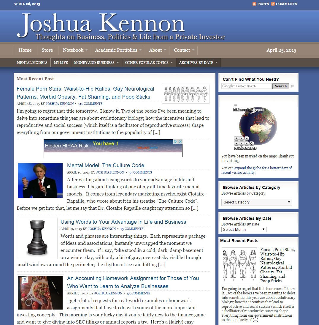
This is what the site normally looks like. It will end up looking similar in the end but during the redesign process, it will look like a big hot mess. Do not worry. All is well. The regularly scheduled programming will return.
TL;DR: Please pardon our mess. Hard hats are to the left. Watch for falling CSS or out-of-control PHP. It will be this way, on and off, for a couple of weeks. Hopefully, it won’t be too intrusive as we’ll try to do most of the work when traffic is at its middle-of-the-night lows. If you see something to which you object, the odds are 10-to-1 it won’t be in the final version, anyway, so don’t worry about it. In the end, little will change from your perspective.
Updates:
- 05/05/2015 at 8:00 p.m., CST – You may witness long requested social sharing buttons appearing and disappearing. At the moment, the PInterest one won’t work because we have a hotlink protection function on that is interfering with its ability to extract images for the pinboards. We are aware of this and it’s on the list of things to fix once everything else has been done.
- 05/09/2015 at 1:30 p.m., CST – The new framework will remain live for the next couple of weeks as we modify and test things. Many of the old posts will have huge “featured” images that aren’t sized correctly and look terrible. Please ignore these. They will be fixed toward the end. In the meantime, I’ve renewed the licensing agreement with Shutterstock so we can get higher quality editorial and stock images for these slots to improve the overall look of the site. You will also notice the old CSS class for captioned images caused some weird line breaks that we have to go in and manually remove as part of the turnover so please ignore those as well. We are aware of them. I’m going to spend the afternoon building the landing homepage.
- 06/02/2015 at 4:06 p.m., CST– Mobile devices aren’t scaling images on certain operating systems so you can’t see whole pictures on posts if you are using, say, the iPhone 6 Plus. That is a known issue. A few of you have been using the reader feature as a built-in work around but have mentioned the fact it takes away the ad revenue to offset the server bandwidth so you’d like me to correct it as soon as possible (I appreciate your consideration in that). 6:10 p.m., CST: Also happening on Android/Chrome. Status: FIXED. 1:10 p.m., CST, 06/24/2015
- 06/02/2015 at 4:07 p.m., CST – We are turning back on one of the major caching systems so the site speed should improve significantly over the next few hours once the static pages have been built and are being served from Cloudflare. Some temporary instability may result. We’re watching it. More information here.
Featured Image Licensing Credit: scyther5 / Shutterstock
Reader Comments (35)
Comments are presented chronologically, with replies indented beneath the comments to which they respond.
twc
April 25, 2015
I am personally not a fan of mobile. I spend most of my time on either a laptop or two professional large screens. But I think this is a meaningful change.
The most important reason is numbers. Most people seem to spend much more time on mobile than on a desktop. The trend is there, it has happened. Arguably, your audience may not be typical users. You can get such insights by using Google Analytics. I notice your website doesn’t use GA.
Sometimes I read articles on a phone when I am outside. Some mobile friendly websites definitely make my reading experience better. I sometimes use a large screen Nexus 6 and the reading experience is ok-ish and improvable. If I happen to bring a Nexus 5 or even smaller phone, I don’t read on https://www.joshuakennon.com/.
Abe
April 25, 2015
The site literally changed as I was browsing. I thought I had clicked on an ad at first. Hope the change goes smoothly!
Also, on the point of mobile reading. While most of my reading is done on a desktop, I do use my mobile when I find myself on the road. As of two days ago, I found the site very manageable even without being modified into a mobile-friendly format.
Joshua Kennon
April 26, 2015
Replying to Abe
Here's hoping! It's proven an interesting experience so far ... I've only wanted to hang my head in despondency or rage quit and watch Korean dramas 7 or 8 times so you could say it's going well!
Abe
April 26, 2015
Replying to Joshua Kennon
Haha, I know the feeling! The great part about it is the immense relief and satisfaction that comes afterwards :)!
Don't forget to take a break or two! Enjoy =D!
Angie
April 25, 2015
told ya
Joshua Kennon
April 26, 2015
Replying to Angie
Hey, just because I've been grumbling about it since About.com warned us 3+ months ago it was going to happen doesn't mean I wasn't eventually going to do something about it, haha!
Though, in the midst of the project itself, I'm beginning to think I shouldn't have bothered this weekend. There's an errant CSS inheritance rule that I'm trying to track down. The code looks right. It's got to be something with the template calling the wrong body type (it's pulling "dark" body even when "light" and sporadically, with no changes, turning the text of the Disqus comment section white-on-white.) I wanted to publish a piece over at About on an inheritance tax loophole ... maybe I'll give this another fifteen minutes then focus on that.
This is turning out to be more frustrating than the migration from when the site looked like this. Or back when it was deep purple, which was still probably my favorite out of everything.
Angie
April 26, 2015
Replying to Joshua Kennon
" Though, in the midst of the project itself, I'm beginning to think I
shouldn't have bothered this weekend. There's an errant CSS inheritance
rule that I'm trying to track down. The code looks right. It's got to
be something with the template calling the wrong body type "
Get a developer. Please do not try to be a superman -- it is foolish. A human cannot be great in all domains. Developers develop best !!
Here is a developer i recommend -- https://www.elance.com/s/piyushpatel2015/10183
Joshua Kennon
April 26, 2015
Of all the lessons I probably still have to learn in life, knowing when to outsource something is not one of them. I don't even mow my own lawn or do my own taxes because it's a poor use of time relative to what I could be doing.
In other words, you're preaching to the choir. When and if something is beyond my capability or interest (some things are simply fun to learn or play around with especially in a hobby environment), my temperament is such I'm the first to hand it off and go on to something else. It's hard to get ahead in life if you try to be a jack of all trades which is the reason I generally avoid attempting it.
(I do appreciate the reference, though, so thank you for sharing it. He might prove useful for something I need done.)
Colin
April 26, 2015
Maybe I'm weird, but if a site doesn't allow me to access a desktop version, I normally stop using the site. I can zoom in on my own if I need to. (typed on my iPhone)
Joshua Kennon
April 26, 2015
Replying to Colin
Me too. I don't think it's weird at all.
thegoblinchief
April 26, 2015
FWIW the site has always read fine on my aging 2nd gen iPad.
Joshua Kennon
April 26, 2015
Replying to thegoblinchief
Thanks for letting me know!
Engineer7006
April 27, 2015
Replying to Joshua Kennon
I've never had any issue on the note 3, I don't even need to zoom in.
As an aside, if a mobile website provides less functionality than the full site (and they often do), I don't use it.
Joshua Kennon
April 29, 2015
Replying to Engineer7006
It won't (have less functionality). It's an identical copy of the same site, only with a responsive design so it rearranges the content and scales the font. Otherwise, exact same everything.
Engineer7006
April 30, 2015
Replying to Joshua Kennon
Glad to hear it, I wish more mobile websites were the same in that aspect.
Nicholas Archer
April 27, 2015
I hate mobile versions too. Was hoping you had some masterplan cooked up to tell Google to go to hell. Will be cool to see your wishlist actualized.
Abe
April 27, 2015
This may be old news to you, but I figured it's worth a repost in case it's not:
http://www.ajc.com/news/news/millionaire-blockbuster-author-dies-in-crash/nkLxS/
DP
April 29, 2015
Can I throw in a request for the ability to smell/taste the wonderfully displayed culinary delights!
Joshua Kennon
April 29, 2015
Replying to DP
It may happen someday! The technology has existed in one form or another for 60 ~ 100 years thanks to the film industry. Walt Disney pushed for it to be included in 1940's Fantasia but couldn't afford it at the time. General Electric created a scent system in 1953 that showed 3D images of flowers with the floral fragrance. Unfortunately, a botched movie premier and technical failures caused poor word of mouth to cause the whole movement to be scrapped back in 1960. What should be a standard ability in devices was reduced to a novelty, spelling its demise, which is a shame. Things have moved along much more slowly, though the perfume industry perfected a device that can deconstruct and analyze any scent within recent decades so the raw capability of "recording" then formulating scents is there. Retail has also been a major driver as many branded stores have subconscious scents pumped through the air to increase comfort and modify mood.
I'll be really excited to see it happen. Imagine if I could post a walk-through for a pot roast or simmering wine sauce and you could experience it just as if you were in the room!
Odai
April 30, 2015
I just submitted a message through the contact form on mobile (Android 5.0, Chrome), the captcha field was missing and in its place was a WordPress shortlink. I was able to submit a message (at least it said I did), despite not filling out a captcha.
I realize this is probably more of a server-level thing, just thought I'd warn you in case it's a weird mobile-specific bug.
Joshua Kennon
April 30, 2015
Replying to Odai
We had to temporarily disable the Captcha two nights ago because it was creating an Apache error for some reason in the new template during the tests. We were trying to isolate another problem (that turned out to be a plugin conflict) and it was distracting us. I haven't turned it back on since we are going to most likely introduce a new contact form system.
I appreciate you writing this. I'm sure all sorts of things are going to go haywire while we tinker and rearrange, most of which won't be intentional. If you spot anything else, please let me know! Even if you send 50 different messages, it's better safe than sorry on our end and you'd be doing us a big favor.
jkaiser20
April 30, 2015
I think an important point is that JK is communicating and listening. Unlike several sites I no longer use because of the website changes. No more espn or cnn for me in last several weeks because they changed to an idiotic format. I can adapt, and have many times. But when a website changes and detracts from the things I have always found useful (which is info, not fancy formats, autoplay videos and junk dancing all over the place) I leave and dont go back.
Thanks for the info, and looking forward as always to the next article.
Steven
April 30, 2015
I notice the site search box is gone in some of these new layouts. Please retain it I use it a lot!
Joshua Kennon
April 30, 2015
Replying to Steven
Worry not. It will be retained and significantly improved. The appearing/disappearing act has to do with modifying and moving other pieces of the puzzle behind the scenes or isolating errors.
While the new search function is nowhere near ready for prime time because we need to go back and refine the category list and introduce post tags on all content and images (which will take us a few weeks once we've switched over - at the moment, it's returning a lot of false positives), you can take a look at if you're curious. Say you wanted to search for recipe posts. The search result page will appear like this.
In fact, you'll be able to enter https://www.joshuakennon.com/?s=KEYWORD in the URL bar and and replace the keyword with whatever you are looking for (compound words will use a - symbol between them) to run your own search in the new system.
Anthony
May 1, 2015
Joshua,
I'm loving this new site direction!
Your re-design comes at an interesting point in my existence where I'm making some decisions that will send my life -- and those of my family -- in a completely different direction. But a direction that, were I not to make that lane change, I always would look back on, in regret.
Kudos to taking this wonderfully valuable resource in a new direction.
Abe
May 2, 2015
I really enjoy the navigation tab on the left. In particular, as a new reader I enjoy that I get to browse your posts by year.
You also may already know this, but quite a few of the links are broken at this time:
1) Contact Form
2) Shop
3) Forum
Best of luck with the continued improvements!
Joshua Kennon
May 2, 2015
Replying to Abe
Thanks for the feedback. The links are definitely broken at this point as they are stand-ins to see things like text alignment and size on different devices when we were moving it around earlier in the process. If you can think of anything you'd like to be available right there, in that main bar, so you can click it instantly, let me know. We haven't gotten to the point of structuring it, yet.
Abe
May 2, 2015
Replying to Joshua Kennon
On the older version of the website, you could browse subjects by topic. While I see that you've retained something similar in the "Browse by Categories" tab, the location (Right Side of Window) and the lack of visual attention makes me question whether others will take note.
I also enjoy that you've numbered the pages within categories. Previously, I had to manually type in the page number into the address bar unless I wanted to endlessly click "Previouis Page" to start reading from the first article.
Joshua Kennon
May 2, 2015
Replying to Abe
1. Duly noted on the visibility of browse by category. Thanks. We'll try and figure something out about that.
2. Me too! One of the prototypes had endless scrolling. I broke some design hearts when I nixed it immediately but I wanted page numbers and wasn't willing to compromise on it. There are apparently dozens of us who like this old-fashion method of browsing! Dozens!
peterpatch79
May 3, 2015
I am a relatively long time reader of this blog and I have to say that the content is 1 or 2 orders of magnitude more important to me then the site design. If you posted your blog articles as ascii text files on an FTP server I would download them on a regular basis and read them. If your website looked like this (http://i.ytimg.com/vi/6kehFztxE7Q/maxresdefault.jpg) I would just use the "show reader view" function in safari or the clearly plugin for chrome to read the site (which is what I do now most of the time anyways).
Routa
May 3, 2015
Just 3 mint with joshuak- < my co-worker's step-sister
makes $78/hr on the laptop . She has been out of a job for 7 months but
last month her payment was $16844 just working on the laptop for a few
hours.
more tips here > < www.Jobs-Cash.Com
llll------------------>
Daniel Luna
May 12, 2015
Love the blog. Very inspiring. Lot's of great reading.
Large pictures are broken on mobile (and I'm pretty much going through the backlog during my commute, so this affects me quite a bit). The pictures themselves are unscrollable (left/right), and if there is any text under the pictures it continues past the edge of the screen. (And I can't resize the page either, which is only a minor annoyance.)
Joshua Kennon
May 12, 2015
Replying to Daniel Luna
Sorry for the inconvenience. There is a new CSS class we have to apply to all of the images in the old 2,000+ live posts that will fit it within the upgraded responsive theme. We plan on making the change at the same time we go in and fix some featured image issues that are on the list.
Thomas McInnis
May 15, 2015
Hi Joshua - I really like the site redesign so far. I have some feedback to improve the reading speed of your text for your visitors that I hope can be helpful. Text sizing may also be impacting your click throughs etc for banner ads, as well as other less measurable visitor actions.
I have found the line length, spacing, and size of the text slightly uncomfortable, so I use the "reader" feature of my browser which strips out the text in a more appropriate layout for reading. The potential downside for you is that I no longer see your advertising banners. My prescription for my reading glasses is up to date 🙂
There is a short (2 min) primer on the topic here that made me completely question what I thought I knew about web type setting: http://mikeyanderson.com/optimal_characters_per_line
Though he takes it to the extreme, it is demonstrably true that his line length and character size improves readability.
The next link is a tool I now use as a starting point for web type setting. It outputs optimal text sizing based on one, two, or three of your desired parameters. In your case it might be you would like to maintain your 900px column width, and simply go from there: http://www.pearsonified.com/typography/
I know how tedious the redesign process can be, best of luck!
Abe
August 16, 2015
I love the front banner on the front page and the organization of the articles below. I wouldn't be able to detail all the reasons why, but suffice to say that it looks wonderful! Keep up the good work.